A woman with long brown hair, glasses, and a white shirt smiling while using a tablet, with bar charts in circular frames in the background.

Bar chart styles

Bars charts are a classic. They make it easy to see differences and trends at a glance, as universally, people are pretty good at interpreting bigger and smaller blocks on an axis. Bars provide a simple way to communicate data, whether placed vertically, horizontally, or stacked upon each other.

Let’s look at the different styles available in Brilliant Assessments in more detail →

Choose from seven different bar chart styles.

In Brilliant Assessments, you can choose from seven different bar-style charts to deliver your feedback.

Bar chart with four vertical bars on an orange rounded square background.

Vertical Bar Charts

Square icon with rounded corners, orange background, and five white horizontal lines resembling a list or menu.

Horizontal Bar Charts

Bar chart with five vertical bars of varying heights on a brown background with an orange gradient, rounded square icon.

Multi-Vertical Bar Charts

Bar graph with six bars of varying heights on an orange rounded square background.

Bar on Bar Charts

A bar chart with multiple horizontal bars on a gradient orange background.

Multi-Horizontal Bar Charts

A bar chart with various horizontal bars in shades of orange and brown on an orange background.

Stacked Bar Charts

Bar graph with five vertical white bars of varying heights on an orange rounded square background.

Histograms

Popular use cases for each bar chart style

Bar chart titled 'Your scores in each section' displaying four sections with respective scores: Section One at 89%, Section Two at 20%, Section Three at 65%, and Section Four at 80%. The chart includes labels with color coding for ratings and assessment level indicators.

Bar-on-bar charts

  • Contrast a single response against a benchmark or a team's average.

  • Provide a dual layer of data interpretation.

Bar chart showing scores on a test, with five questions on the y-axis and their corresponding percentage scores on the x-axis. The bars are colored orange, brown, and green, with labels indicating rating lines and bandwidth.

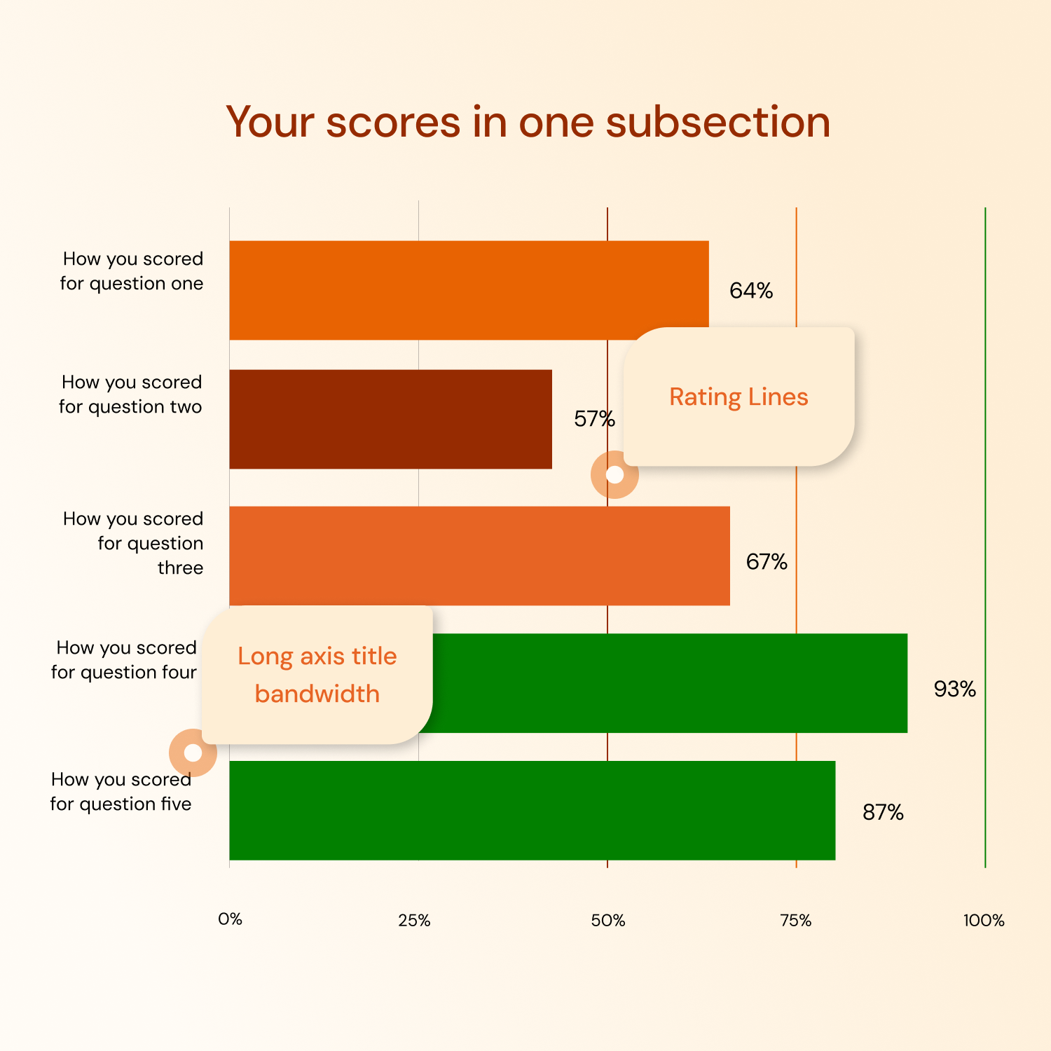
Horizontal bar charts

  • Enjoy more space for axis descriptors if needed.

  • Create bars for each scored level of the assessment (sections, subsections, segmentations, questions)

A horizontal bar chart displaying answer distribution across a cohort for four questions. The chart has color bars for answers: green for 'Always,' orange for 'Sometimes,' and brown for 'Never.' The percentages for each answer vary per question. There is a label in the center that says 'Color Bars by Answer.'

Vertical bar charts

  • Create bars for each scored level of the assessment (sections, subsections, segmentations, questions)

  • Illustrate comparative scores with rating colors

A bar chart comparing your team and company benchmarks across four sections labeled A, B, C, and D. Your team is represented by orange bars, and company benchmarks are in dark gray. Section C shows the highest scores, with your team performing below the benchmark, while the other sections have varying performance.

Stacked bar charts

  • Show the distribution of answers within a cohort report.

  • Group answers that are associated with a set of questions.

Bar chart titled 'Performance by role level' comparing different role levels across two assessment areas with categorized data by roles: Board Member, Manager, Senior Manager, Executive, and Supervisor, with labels indicating Likert scoring and classifiers.

Multi bar charts

  • Compare individual or group responses alongside benchmarks.

  • Split bars by the classifier, role or any other grouping

A bar graph titled 'Age Group Distribution' displays response counts across age groups from 21-30 to 91-100. The highest response counts are in the 71-80 and 61-70 age groups, with smaller counts in the 21-30 and 81-90 groups. Two annotation bubbles indicate 'Count of Responses' near the y-axis and 'Map patterns against classifiers' near the right side of the graph.

Histograms

  • See the diversity of responses across classifiers.

  • Map distribution patterns in a single glance.

Build a brilliant bar chart with classifiers, benchmarks, and ratings

While bar charts may seem a bit plain, there are many ways to customize the appearance and add elements that make bars easy to read and interpret.

Diagram showing three groups: Chief Executive Suite, Middle Management, and Individual Contributors, each represented by colored square icons and labeled accordingly.

Classifiers

Classifiers provide at-a-glance comparisons of the distribution of responses across categories. Quickly see patterns, trends, and the proportion of respondents in each classification.

An infographic with three squares and corresponding text. The first square is dark red, labeled 'Your Score'. The second square is orange, labeled 'Your Team's Average Score'. The third square is light beige, labeled 'Your Company's Average Score'.

Benchmarks

Create reference points that compare individual or group assessment scores against predefined standards or average scores. Highlight areas that meet, exceed, or fall short of benchmarks.

Color-coded competence levels: green square labeled 'High Competency,' orange square labeled 'Some Competency,' and brown square labeled 'Low Competency'.

Ratings

Provide a measure of performance or proficiency with banded scores and ratings. Color code bar charts according to ratings and offer a clear representation of how scores vary across different areas.

Bar chart comparing leadership and innovation percentages across job roles: Board Member, Executive, Manager, Supervisor. Executive has the highest percentage, followed by Supervisor, Board Member, and Manager with varying differences between leadership and innovation.

Customize the look of your bar charts

While bar charts may seem a bit plain on the surface, there are many different ways to customize them and add detail.

Data labels

Add labels to the end of each bar to make data and scores easy to interpret. Choose to display as a percentage, likert score or actual score.

Bar chart showing team scores for Lateral Thinking, Active Listening, Empathy, and Assessment with team average and Jenny Horrell's scores. The background is a gradient of reddish-brown.

Chart colors

You can override rating colors and set custom colors for each bar or in multi-bar charts. You can also set quick color themes at the advanced rating level.

Chart showing rating bands and lines for an 87% score. The top section has a horizontal bar divided into brown, orange, and green segments, with the green segment indicating 87%. The bottom section displays a horizontal black line with small red, orange, and green marks, and the percentage 87% labeled.

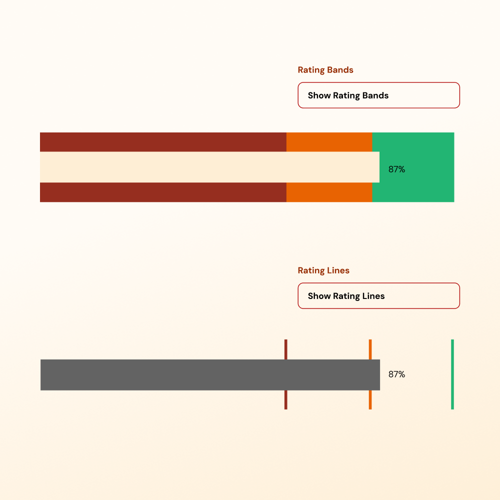
Rating Lines & Bands

Show rating thresholds as colored backgrounds of colored lines. This shows respondents how close they are to the next level

Bar chart comparing leadership and innovation percentages among different roles, with roles including Board Member, Manager, Senior Manager, Executive, and Supervisor, set against a brown-orange gradient background.

Backgrounds

Make charts stand out against detailed backgrounds in your report, or add emphasis with background colors and border options.