Line charts
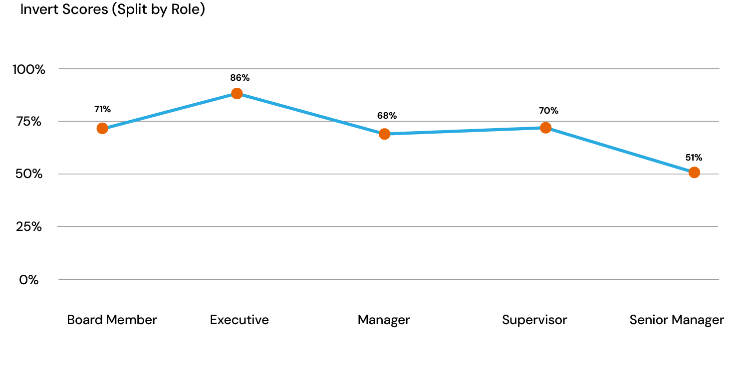
Line charts are best used to depict a data point in time. They are intuitive to read and relatively straightforward to create.
In a line chart, typically, each data point represents a specific value corresponding to a time interval. These data points are connected by lines to indicate progression or movement. The y-axis reflects the measured metric values. Brilliant Assessments also supports line charts displaying multiple data series on the same graph, making comparing trends or metrics across different datasets easier.
Single line charts
This style of chart provides a smooth visualization of comparative data over multiple categories. They can be used with either percentage or actual average scores, offering flexibility in interpreting the data.


Multi-line charts
Used in feedback and cohort reports, Multi-Line Charts show benchmark results alongside individual or group responses, facilitating a multi-layered performance analysis over time or across categories.


Area chart
Area charts are versatile, used for both comparative analysis and in conjunction with benchmarks. They offer a filled-in view between data lines, making trends easier to spot.


